BIM Connected is a young company from Eindhoven that deals with information and digitization issues within the infrastructure, construction and energy sectors. They believe in the sustainable use of data. They make data valuable, with which designers, builders and managers can make better decisions.
Within a short period, they have grown rapidly. To structurally build an attractive organization for both staff and clients, they asked DeltaZuid to help strengthen their brand. Together with BIM, we defined and established the brand identity. And thus created the new corporate image.
Rebranding
BIM Connected

Identity as a foundation
for a brand-driven organization
Creating a strong brand always starts from the basics, a solid and clear brand identity. Only then can you start with the various building blocks that make up a brand. Unlicensed copy of the Froala Editor. Use it legally by purchasing a license.
Using DeltaZuid's Brand Identity Canvas™, the identity of BIM Connected was researched and analyzed. In several brand sessions, all key elements were scrutinized, defined and captured in a functional reference book, the ID-Book. This practical document helps to get everyone in the organization on the same page, to make choices, to give direction and to make decisions. In short, to realize a brand-driven organization.
Using DeltaZuid's Brand Identity Canvas™, the identity of BIM Connected was researched and analyzed. In several brand sessions, all key elements were scrutinized, defined and captured in a functional reference book, the ID-Book. This practical document helps to get everyone in the organization on the same page, to make choices, to give direction and to make decisions. In short, to realize a brand-driven organization.
Creating a strong brand always starts from the base.
A brand new
logo
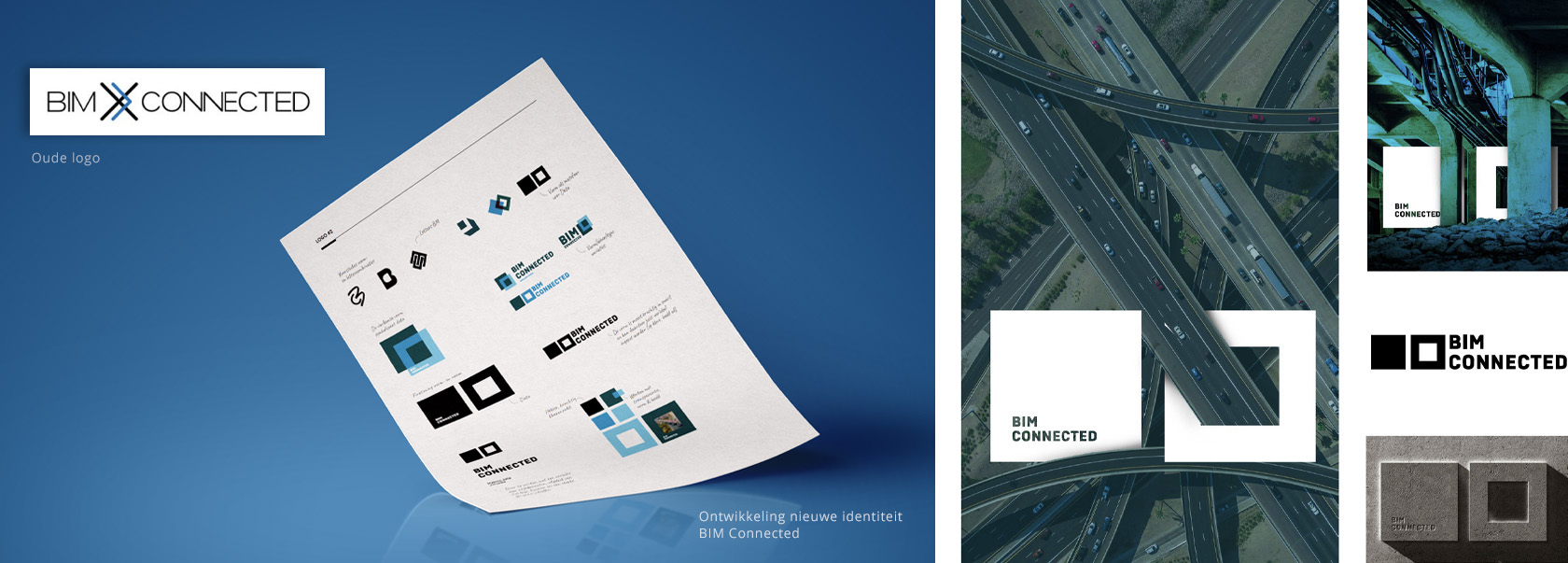
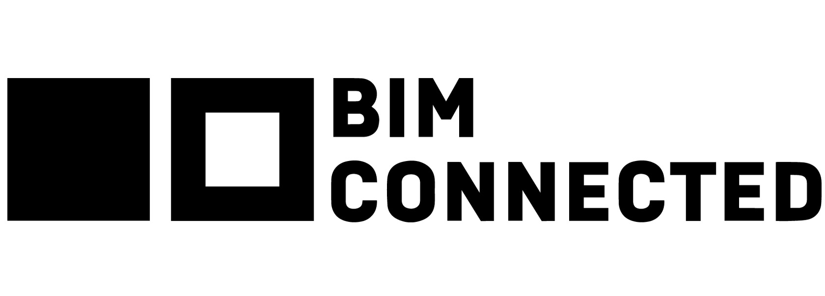
The logo is one of the most important visual expressions of a brand, so it must show what the brand stands for.
The square shape in the logo represents strength, foundation, building block, data, stability and trust. This shape language is thus a metaphor for the strong standpoint from which BIM operates. No nonsense, binary, clear, powerful and complete. The connection between the two forms, one closed and the other open, refers to the variety of data but also the clear overview that BIM has/maintains in the complex matter.
The square shape in the logo represents strength, foundation, building block, data, stability and trust. This shape language is thus a metaphor for the strong standpoint from which BIM operates. No nonsense, binary, clear, powerful and complete. The connection between the two forms, one closed and the other open, refers to the variety of data but also the clear overview that BIM has/maintains in the complex matter.
Making data
valuable
"BIM Connected combines knowledge of IT as well as the construction, infrastructure and energy sectors in a unique way. They provide insight into the information and data that is important. So organizations can work faster and more pleasant and make better decisions."
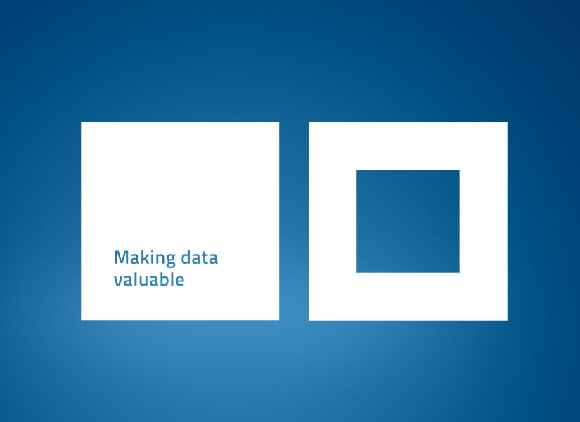
To reinforce this brand promise, we developed a powerful payoff:
Making data valuable.
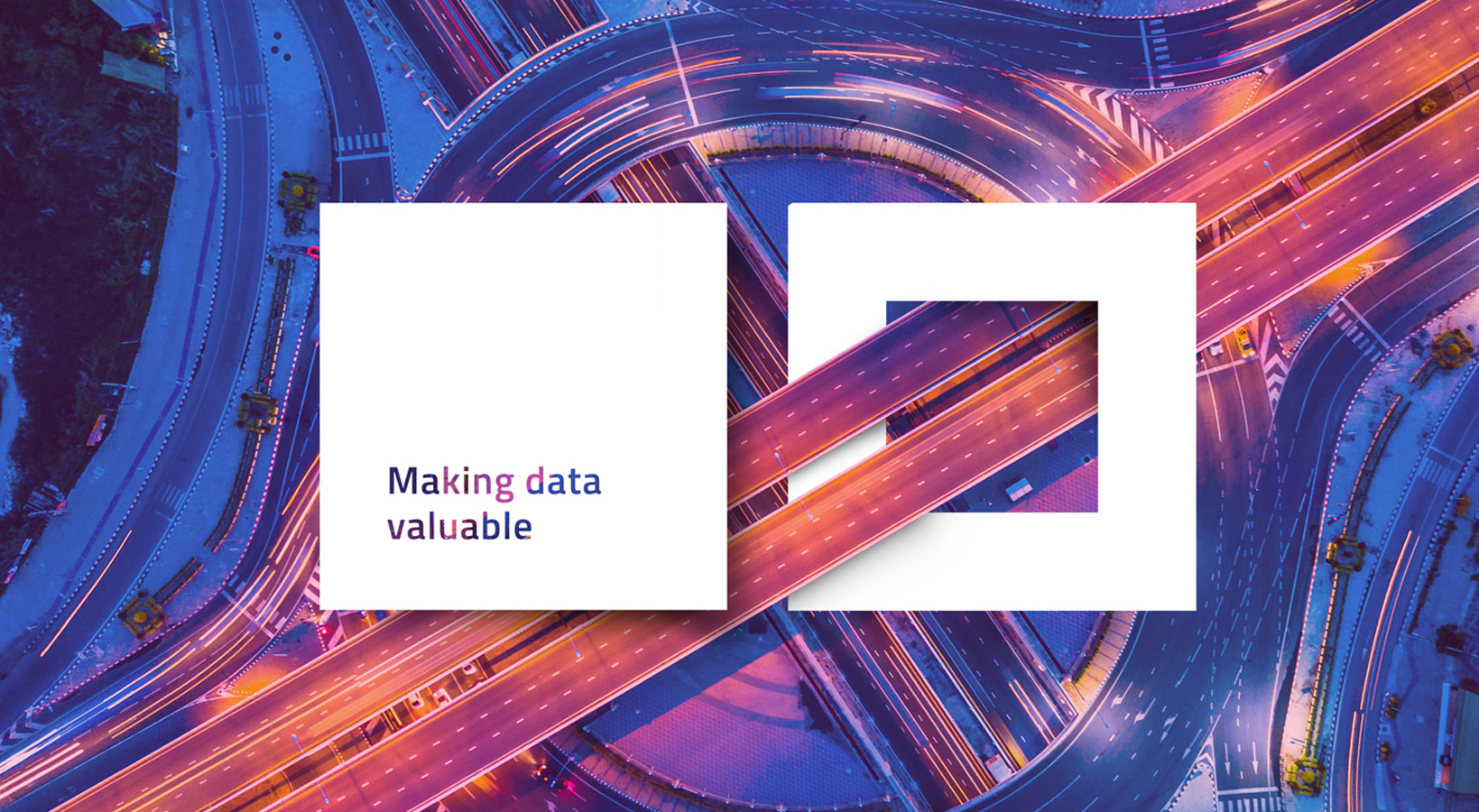
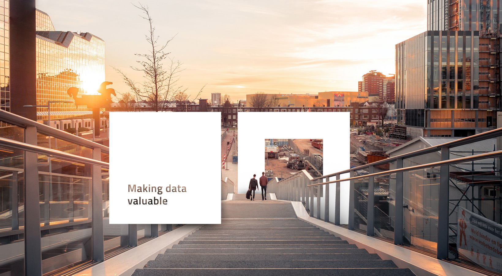
The pay-off is linked to the logo as an additional style element. This reinforces the message and creates numerous opportunities to communicate both visually and textually.
An expressive visual language
to support positioning
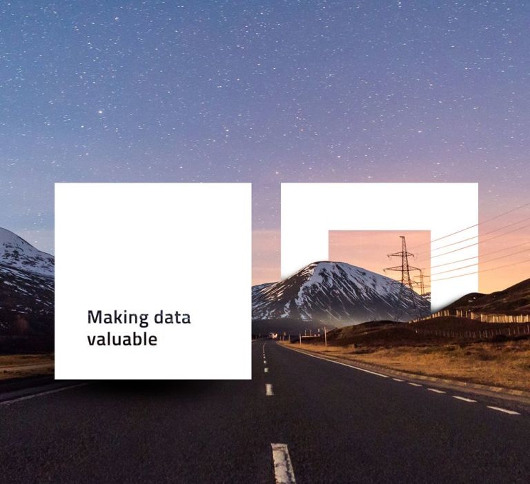
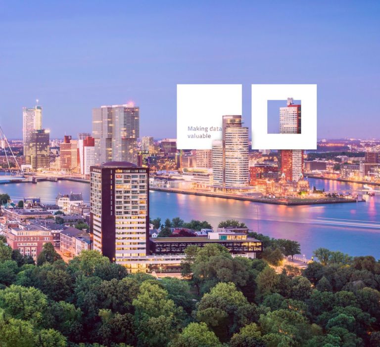
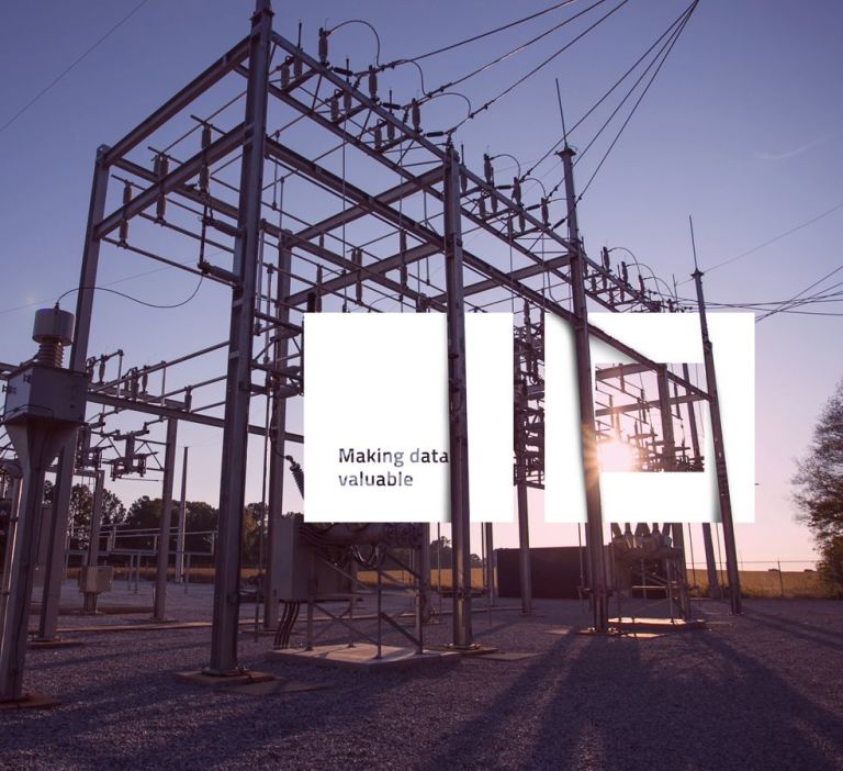
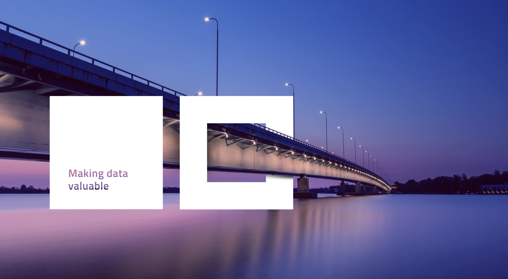
An expressive, distinctive visual language helps to generate recognition. We therefore developed a series of unique images, in which the logo (with pay-off) is dominantly but playfully and accessibly integrated into an environment that refers to the sector in which BIM Connected is at home. Integration, expertise, and the application of data are all phrases that refer to the Hero, Sage and Jester archetypes.



Miscellaneous Resources
The brand is reflected in everything. Don't just think about a logo or website. It starts with the development of the right building blocks of the brand, such as the tone of voice, the brand story, the visual language and style elements such as color, typography, shape, etc. Art direction of photography and film also play a role.
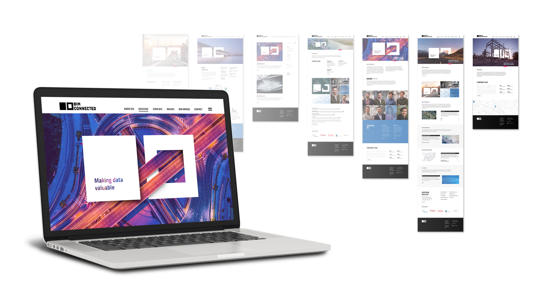
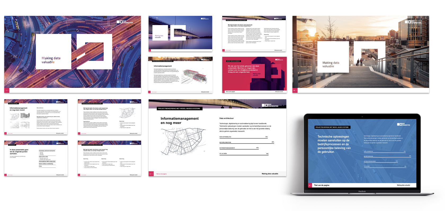
With all these elements we can create the necessary communication tools. From website to business card and from corporate brochure to the decoration of the building.
With all these elements we can create the necessary communication tools. From website to business card and from corporate brochure to the decoration of the building.

brand Identity
ID Scan
Analysis + Report
Why How What
Brand Values
Brand Personality
Brand Promise
ID-Book
Analysis + Report
Why How What
Brand Values
Brand Personality
Brand Promise
ID-Book

brand Creation
Brandstory
Payoff
Logo
House style
Picture concept
Website
Powerpoint templates
Brandbook
Payoff
Logo
House style
Picture concept
Website
Powerpoint templates
Brandbook

brand Management
Strategic consultation
Operational support for launch
Social media
Operational support for launch
Social media
 Questions about this project?